
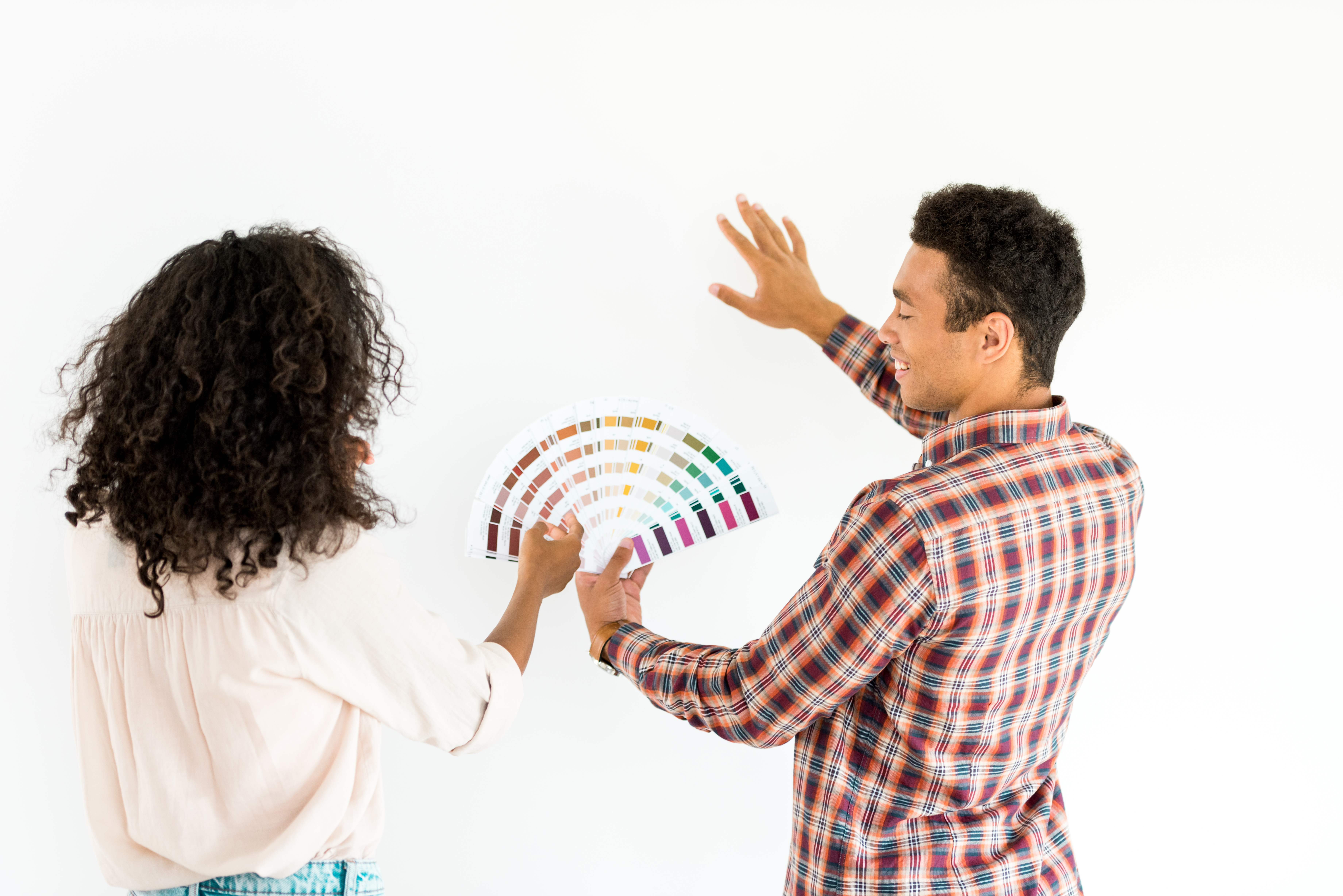
Color is a language for many people. It’s an experience that could do so much for this world and its complexities. One unusual yet common thing that color can do for you is to improve your mood. The perfect blend of hues or tints could create either the most captivating or washed-down atmosphere. Some people grow attached to certain colors because they remind them of certain emotional triggers and draw them back to important moments and things.
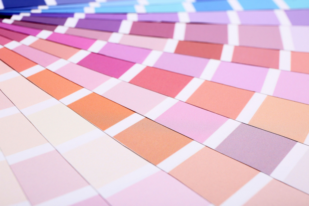
The power of color is something you may learn subconsciously or consciously. Nonetheless, it’s a wonder that many cannot escape when it comes to mood and emotions. The following are some color palettes that can improve your mood:
Woody
A woody color palette is usually inclusive of the following colors: black, grey, and brown. It could also be inclusive of some darker or lighter versions of those colors. Some hues and tints of those colors could be present as well to give this palette more range. If you’re looking for specifics, this palette would have tan brown, rust brown, night black, cloud gray, and ash gray.
Such colors tend to make for a moody and sophisticated ambience. Brown is quite an intermediate color. It could be very dull and uninviting but could also be earthy and captivating. Black and gray could be associated with style and class. This color palette could also be welcoming because brown colors tend to be relatively appealing.
Brown is one of the primary colors of nature, and nature will always be present and beguiling. Oftentimes, you may feel subpar, disconnected, or unfamiliar with where you belong. If you’re looking to feel invited to and accepted in a certain place or you’re looking to be subtly reminded of sophistication and refinement, a woody color palette could help boost your mood and get you to that place emotionally.
Jewel
The word ‘jewel’ on its own represents precious metals and incomparable stones. A jewel color palette consists of colors celebrating the essence and meaning of jewels. The colors usually associated with this are dark green, pistachio green, beige, maroon, and light brown. This is a more vibrant and royalty-inspired palette.
Jewels were typically associated with the most important or distinguished people. The world is becoming more conscious of the fact that hierarchical structures need to be disabled and preciousness is universal. This color palette could encourage good levels of appreciation for the spaces you occupy as it’s bright, modern, and relatively feminine.
Most of the colors within this palette are present and youthful. They have this strong confidence and divine female energy attached to them. Sometimes, you may feel discouraged, outdated, or unappreciated, or your mental health could be low. This color combination could positively affect your mood by inviting high energy, an element of preciousness, as well as youthful vibes into your space.
Lake Algae
Algae usually enters rivers or lakes when there are many plants surrounding a river or lake. It’s usually strange and uninvited, but when you look at its color and all the surrounding colors, you’ll find that they make for a particularly warm blend. A lake algae color palette is typically inclusive of the following colors: moss green, stone blue, indigo, artichoke green, and olive brown.
The sound of the names of these colors already comes with an earthy vibe. You can tell that an alternative earthy feel is brought about by the blend of these colors just from the inclusion of the words ‘olive,’ ‘moss,’ and ‘stone.’ Furthermore, this palette consists of colors with depth. It could feel confrontational at times given that it has a masculine and organic energy associated with it. Indigo is a warm color with a lot of depth attached to it and could unveil a comforting, dark nature. Meanwhile, your greens and browns could be a celebration of being organic and fresh.
Lastly, stone blue is a variation of blue that promotes a sense of calm and peace in this palette. People can suffer from emotional discomfort, feeling expired or unwanted, and anxiety every now and then. This color palette could help you engage with your depth and allow you to be comforted and calmed by how wonderful of a person you are.
Lush
From time to time, people fall out of their ‘groove’ and lose touch with the things that have been working for them for years. This is something that happens often when it comes to finances. You may be thriving one minute and then slowly become unfamiliar with how to approach anything related to money. A lush palette includes colors that invite energies of stability into your spaces. The colors typically associated with this are royal blue, navy green, blush rose pink, breeze white, and gold. The palette has a warm sense of luxury and timelessness attached to it.
Royal blue is a sophisticated color that represents luxury and stability alike. Gold and navy green are also associated with luxury but are particularly representative of timelessness because they’ve been seen as luxurious or superior colors for decades.
Blush rose pink is the unpredictable or unexpected color in this palette. It blends well with the other hues and creates a youthful feel in various places. Sometimes gold and royal blue may invoke an ‘old money’ aura, but the blush rose pink could draw you back to the feeling of timelessness.
Maintaining stability in life is hard, especially when it comes to financial stability. It could leave you stressed, anxious, and concerned about your future. The colors in this palette won’t give you a million dollars, but they could take you to a place of peace and remind you of what needs to be done for you to attain long-term stability. They could allow you to familiarize yourself with comfort and luxury and how to achieve both. What’s more, the colors could help you have a mind that’s open to financial stability.
Seaside
Many people around the world are just utterly in love with the sea or the ocean. Being at the seaside makes them feel at ease. Whether it’s the sound of the waves, the softness of the sand, the view of the sky, or the feel of the water, the sea or ocean has a way of making people feel better. If you’re one of those individuals, this color palette could help put you in high spirits.
A seaside color palette tends to be inclusive of the following colors: caramel, red lip, lake blue, dust white, and baby blue. These are more on the lighter side of the color range, and they serve to create a light and airy ambience. The bright aura of the seaside is real and existing.
Therefore, some may say that this palette is trusting. The blue colors within this palette help elevate that trusting feel because blue is usually representative of bodies of water such as the sea. If you’re feeling sad or uneasy, this range of colors might just help uplift you by reminding you of the seaside and the peace it brings.
Homegrown
Homegrown refers to something cultivated and taken care of in one’s own space or garden.
Home should be a safe place for you and your heart. It should involve a circulation of love and appreciation. Beyond the people that live in the house, this feeling could be created through your use of color.
A homegrown color palette could consist of the following: crepe pink, satin, crimson, lavender, and linen.
The lavender and crepe pink help create a feeling of love and romance.
They can remind you that you’re loved and appreciated in that particular space. Linen, crimson, and satin will enable you to elevate the comforting and cozy feel attached to the home. The blend of these colors highlights the idea of being homegrown. If you find that like you lack belonging or are underappreciated, this color palette could either make you feel more appreciated or remind you of the spaces where you’re appreciated.
Pumpkin Patch
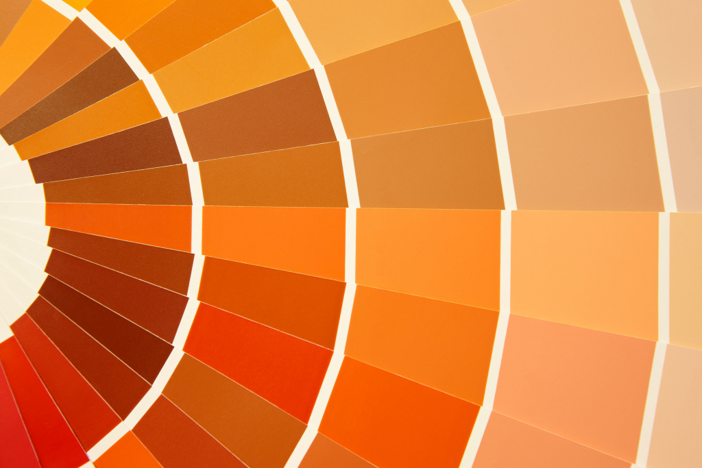
A pumpkin patch refers to a garden where pumpkins are grown. Pumpkins are usually associated with the autumn season, and fall usually comes with a warm, fuzzy feeling. A pumpkin patch color palette is usually inclusive of fall leaves brown, pumpkin orange, frost white, cranberry red, and hunter green. All these colors are explicitly nature-related, involving various aspects of flora.
However, they particularly gravitate toward the warm colors of nature. The mellow feeling of fall is brought together by these comforting hues. If you’re feeling mentally scattered and neutral, this palette could invite harmony and warmth into your space. Explore some fall photoshoot ideas or have a blend of these colors painted on your wall to get yourself started.
Choose Your Palette
The power of color is alive and present. Whatever your mood may be, there’s likely a color that can either represent or improve it. Think carefully about the colors you include in various spaces. Whether it be wall paint, duvet cover colors, or even the hues in your clothes, always be mindful of color so you can keep your emotional state in check.


