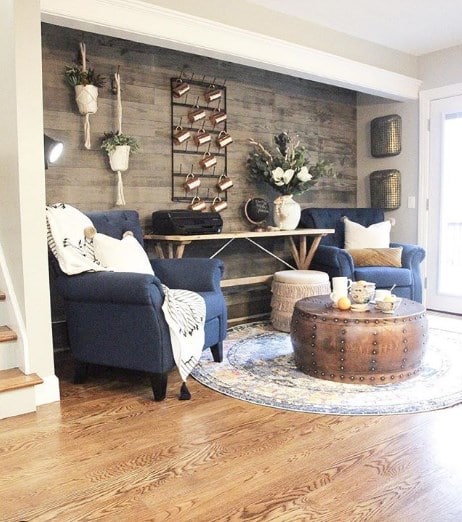
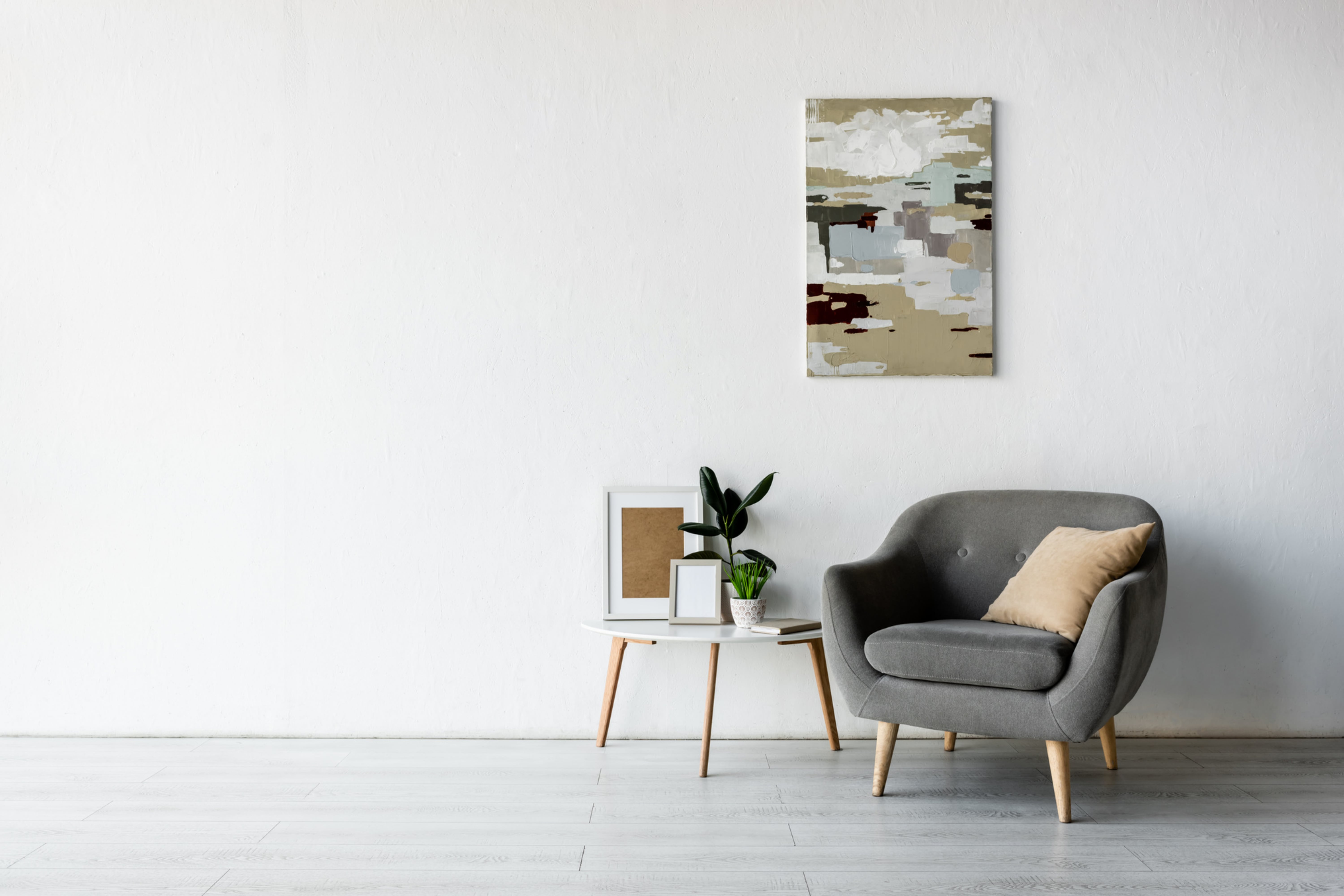
Sometimes it’s enough to fix just a few flaws, and the room will look completely different. And here are some of the most common mistakes that many decorators make.
Mistake # 1: Carpet is Too Small
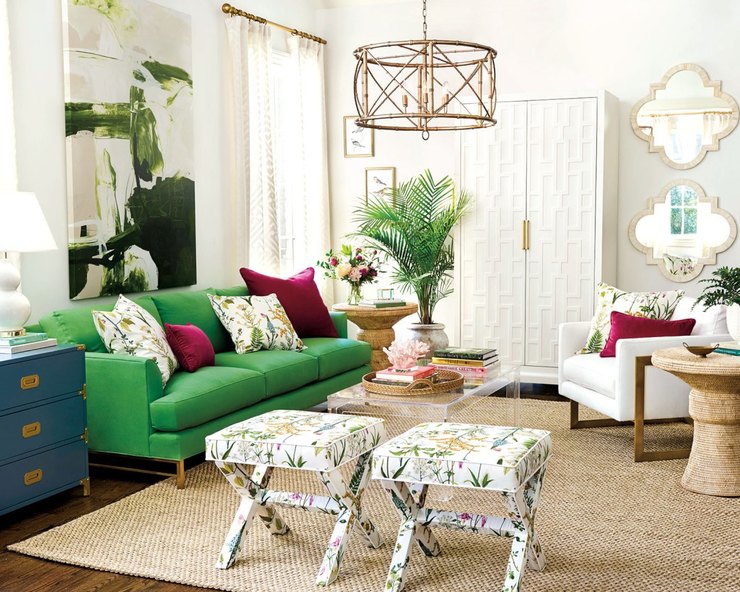
Larger carpets can be very expensive, so some owners, in an attempt to save money, get smaller once. We understand you well, but the problem is that too small carpet can make the room visually smaller.
What to do: Consider purchasing a more economical rug – for example, made not from wool, but of from synthetic fibers. The golden rule: the carpet should pass along the edge of the furniture or retreat from the wall by no more than 30 cm.
Mistake # 2: Furniture is far apart
In an effort to free up space in the center of the room, many of us place furniture along to the walls – thereby, separating the furniture group into separate pieces of furniture.
Such an approach can change the geometry of the room for the worse, from which it will look smaller -, and this is exactly the effect that we all strive to get rid of.
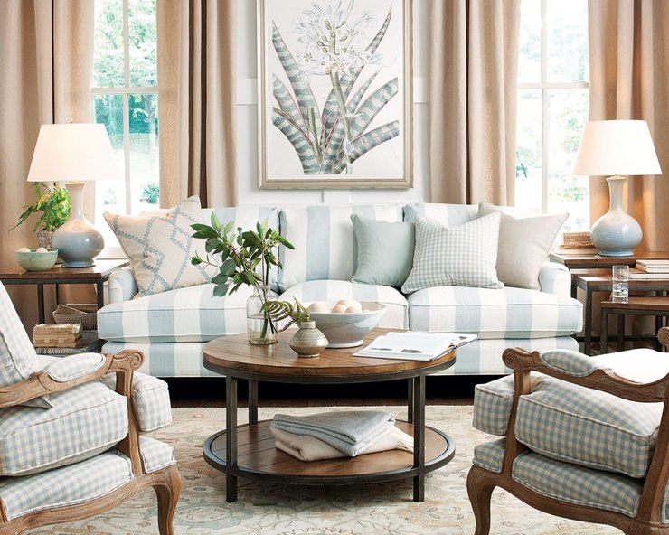
What to do: Check the furniture layout in your apartment. According to the rules used by professional designers, chairs should be at a distance of about 25 cm from the sofa.
A coffee table should be located 20−45 centimeters from the upholstered furniture. Armchairs should be placed 10-30 cm apart (you can put an accent table between them). To have a pass between pieces of furniture, leave it from 60 to 90 cm.
A coffee or coffee table should be reached by hand from an armchair or sofa.
Mistake # 3: Low Light
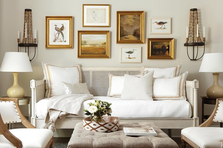
Multilevel lighting gives the room a cozy, warm, and attractive look. In the dim light, even the most expensive interior can become flat and nondescript. Remember: ceiling lights alone cannot provide good lighting.
What to do: Install several lights in the room. In addition to ceiling lighting, at least three more light sources are needed. It can be sconces, floor lamps or table lamps.
Mistake # 4: Incorrectly selected curtains
Curtains perform several important tasks at once: they provide privacy, make the design more complete, visually increase the height of the ceilings, add colors and textures, and help fill in the empty space.
Saving on curtains – for example, hanging the curtains too low or using a narrow cornice – you risk spoiling the whole impression of the interior.
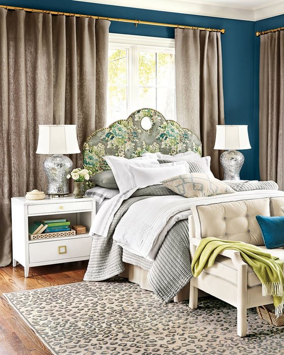
What to do: A universal rule for all interiors – it is better to install a cornice directly under the ceiling molding. Exceptions are rooms with very high ceilings. In this case, the cornice must be hung at a distance of 20−45 cm from the window.
Do not try to save on the width of the curtains! The cornice should be much wider than the window opening – at least 15−20 cm. This is necessary to ensure convenience in the subsequent use of textiles.
If you want to let in more natural light into the room, you can slide the сurtains into the wall next to the window opening.
When calculating, follow a simple rule: the width of the curtain should be twice the width of the window.
Mistake # 5: There are too many accents in your interior
If you enter a room and your eyes begin to dart from one bright point to another, your interior suffers from an overabundance of accents.
Accents are necessary – without accents, the design may look lifeless and flat. But in everything you need to know the measure.
What to do: As an accent, you can use an architectural element, a view from a window, an object of art, a fireplace, designer furniture, a large mirror, a textured surface or a beautiful carpet.
The list is quite voluminous. Choose one or two options suitable for you – and organize the space so that the accents point becomes the main element in it.
Photo: Legion Media


